Saturday, March 31, 2012

Posters


Here are some posters that we made over the time...
It is what it is | by TOMato Design
Typovetica Helgraphy | by TOMato Design

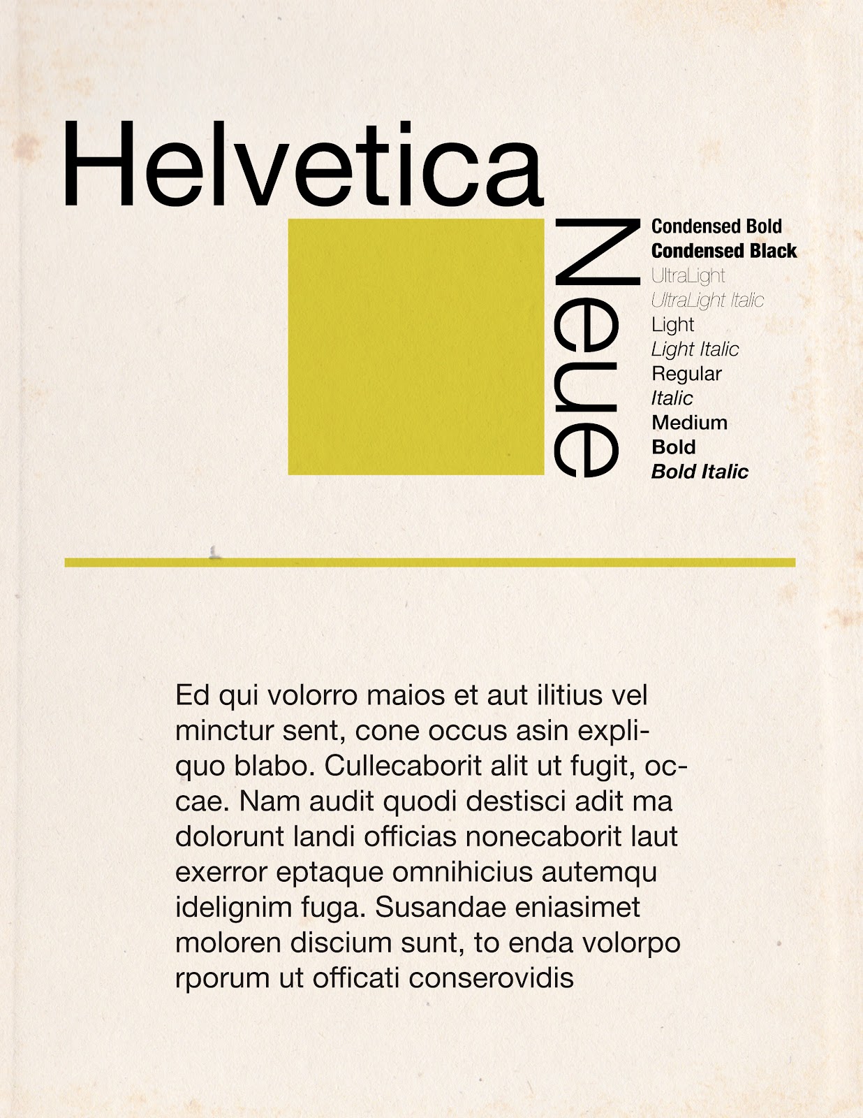
Helvetica Neue | by TOMato Design
Special K | by David
Black Holes & Douchebags | by David


Thursday, March 22, 2012

Dear Starbucks


Dear Starbucks,

we know each other for 5 years now and I have to say I still love you like on the first day. You're so inspiring, my dear. A lot of ideas pop out of my head, when we are together. For that I want to thank you very much!
But I was thinking... You see, we meet at least twice a week for hours, which is great, but you give me serious financial problems. I enjoy the time we spend together, but I can't afford it so often.
So, I hope you'll understand if I try to get some distance.. I don't know, if I'm able to do this, but I think it's better for our relationship.

love,
Tom


Tuesday, March 20, 2012

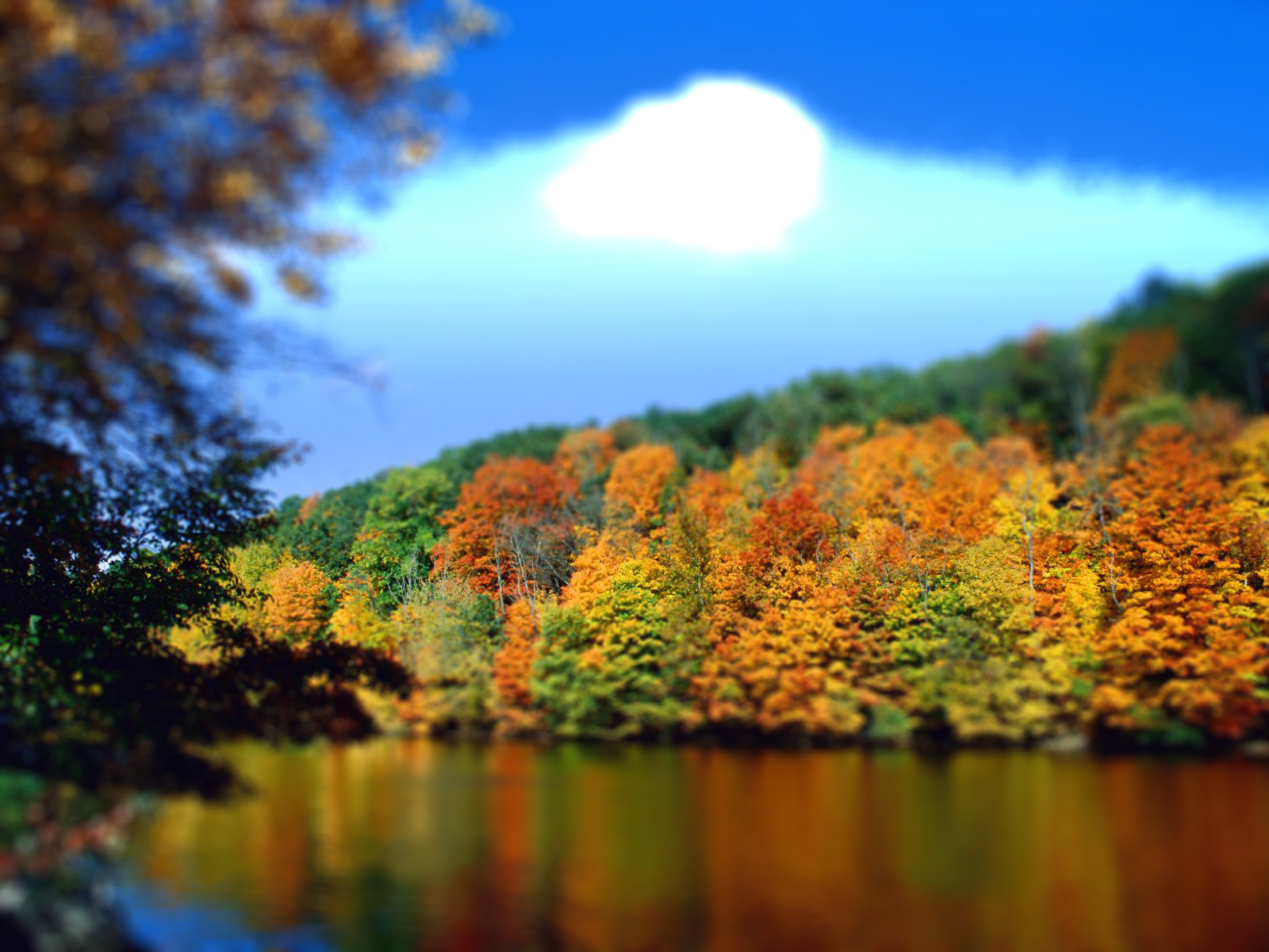
Tilt Shift

We all love the Tilt Shift! We're so fascinated, how a little adjustment in the sharpness can have such effects.
So we three do a lot of shifting. Here are some of our real-life-miniature-pictures :)

SAP Arena, Mannheim | by TOMato Design
Augustaanlage, Mannheim | by TOMato Design 
Augustaanlage, Mannheim | by TOMato Design
Nature, Anywhere | by TOMato Design

Wan Chai , Hong Kong | by SilVotography

Wan Chai at night, Hong Kong | by SilVotography 

The Mall, Hong Kong | by SilVotography

Thursday, March 1, 2012

Giveaway - Facebook Covers

I recently made some Facebook covers for the new timeline and I'd like to share them with you. So here are 9 covers free to use :)

Sunday, February 26, 2012

FUN - Inspired by rawz

David and me were sitting in a nice cafĂ© and wanted to create something. So we opened Illustrator and thought of some styles… We really love the Abdzeedo Rawz logo and decided to make something in that style. 


We needed a short word, to make the typo look more like the original. FUN seemed great, because everybody likes fun. 
Here's what we got for the main shape:


As you can see, the rawz logo has those little lines inside the letters, so the next step was to create those. We made them a bit thicker, because we just wanted to get away from the original, so it won't be like copy and we liked those thicker lines.

And with that, the typo was done. Now we had to make a cool picture out of it. A modern style seemed good. We thought of a appropriate background and ended up with this:


But for this style, we didn't like the yellow anymore, so we changed it to a bright neonish blue. Both shapes, the black and the blue, got a blue outer glow. And so we were done.


Wednesday, February 15, 2012

Musee d' Orsay


Another tilt-shift effect picture. This time from the Musee d' Orsay in Paris.

Monday, February 13, 2012

uninspired?

Well guys, I have to types of being uninspired:

  1. No ideas, no motivation (well, just don't do anything)
  2. Motivation, no ideas (crap, and now? Sitting in front of an empty file for an hour...)
I just found out, if I'm motivated, I should do something. It's amazing, how this actually works.
So I opened Illustrator and thought. I decided to make some typography. Well it started with this: 


And I liked it, so I continued with the other letters and modified them a bit. And soon it became this:


And I really liked it, so I wanted to make it good. Photoshop time. Some colorful blur should help. And it helped. Here's the final result:


You can find the picture in my gallery as well